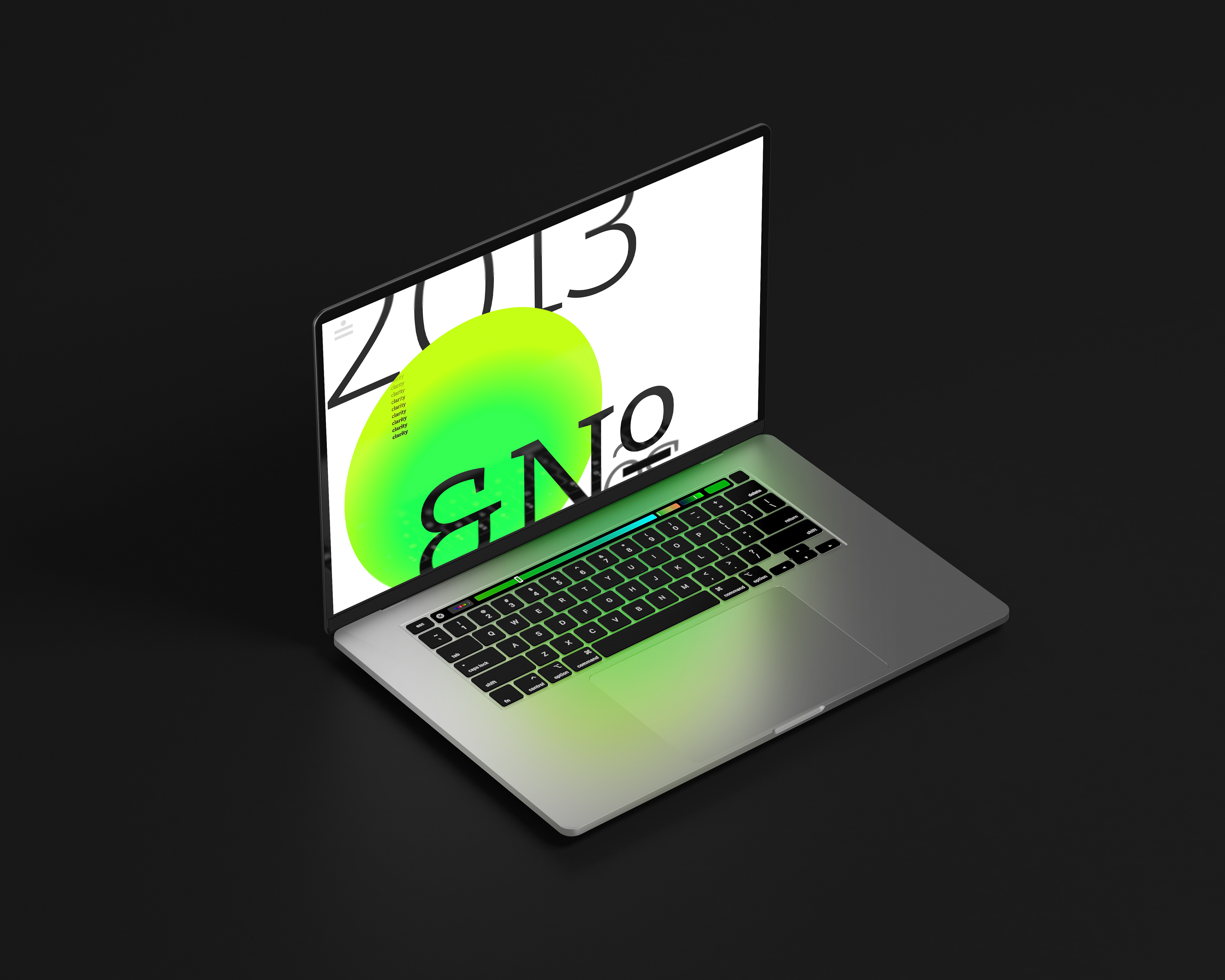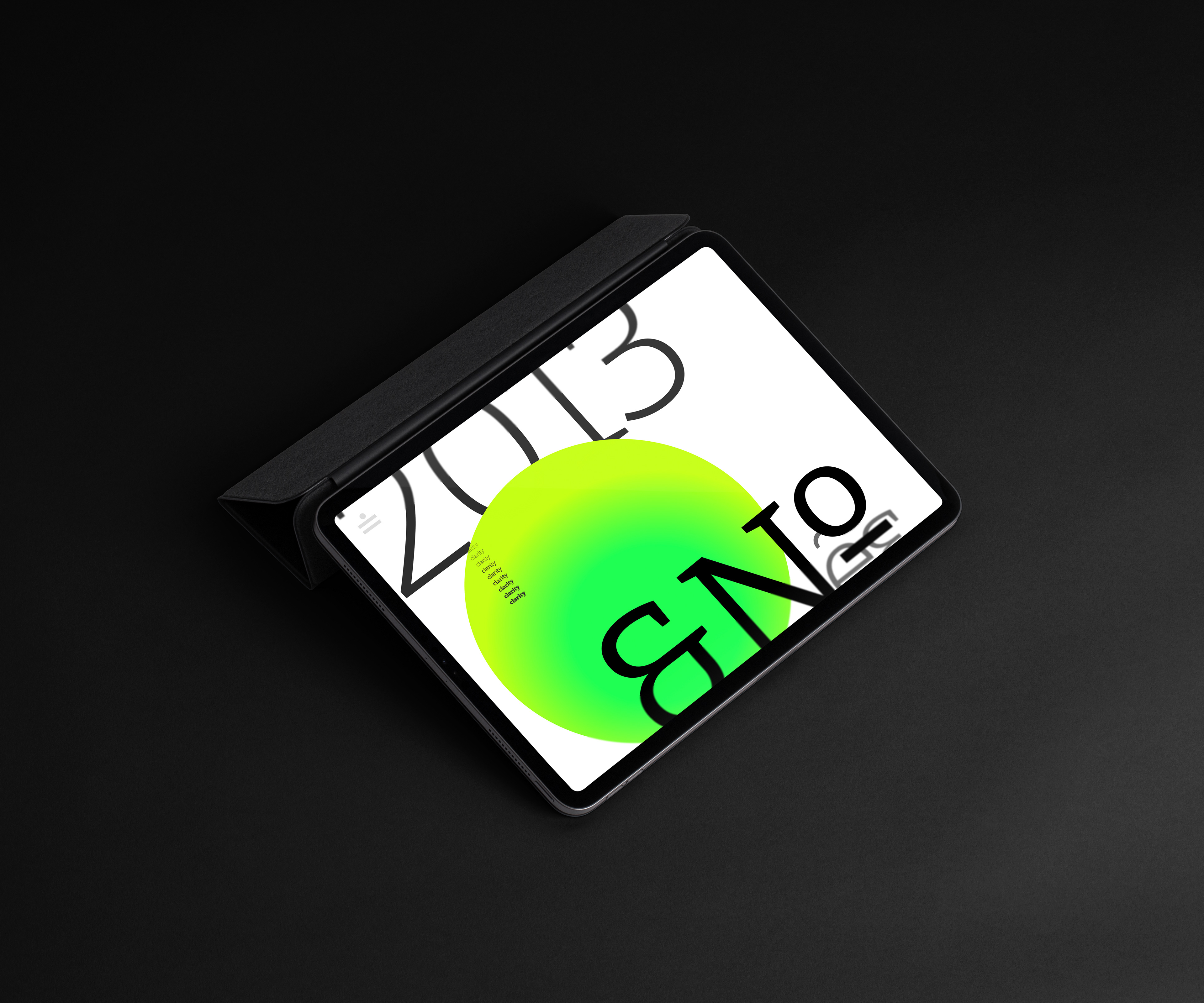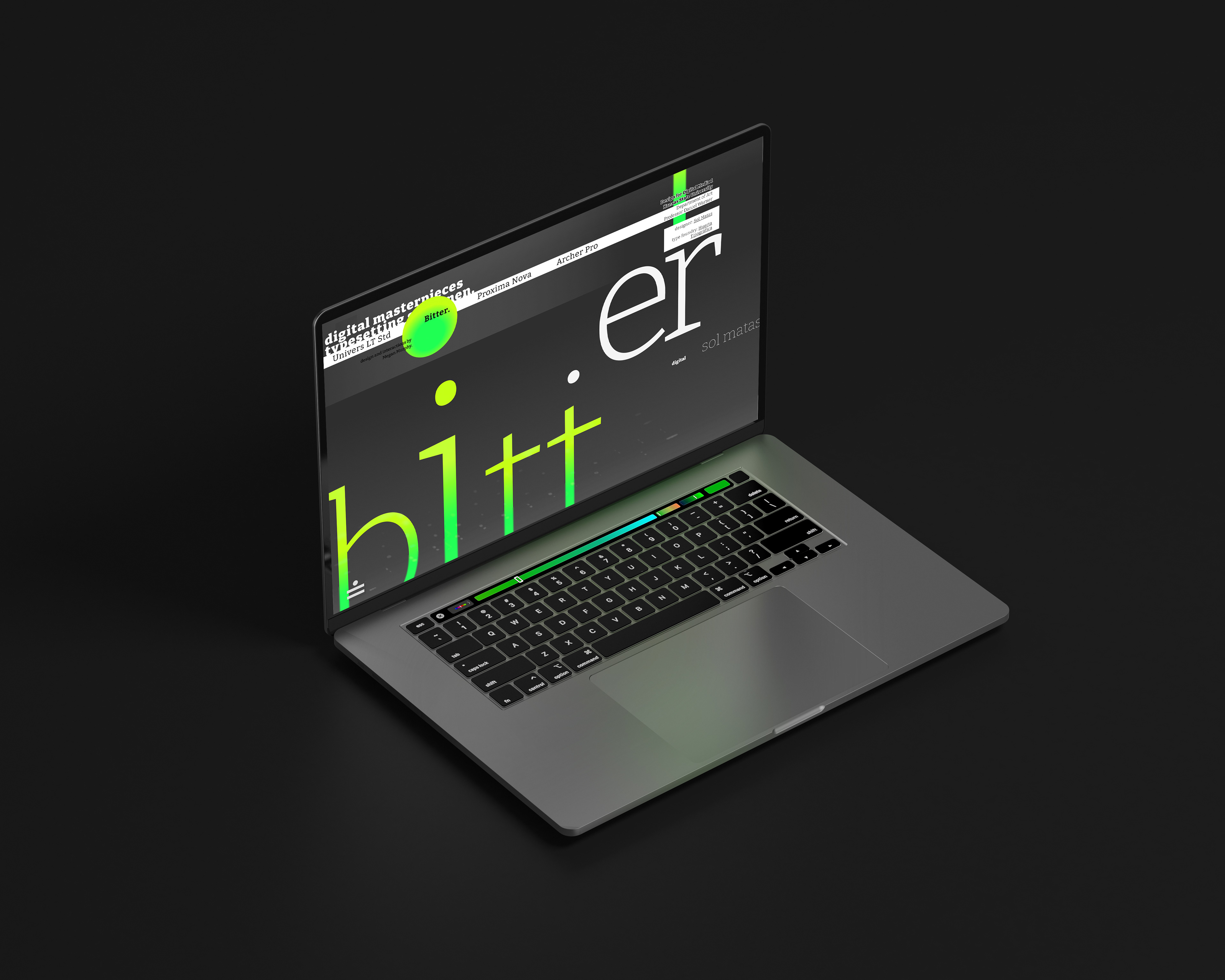
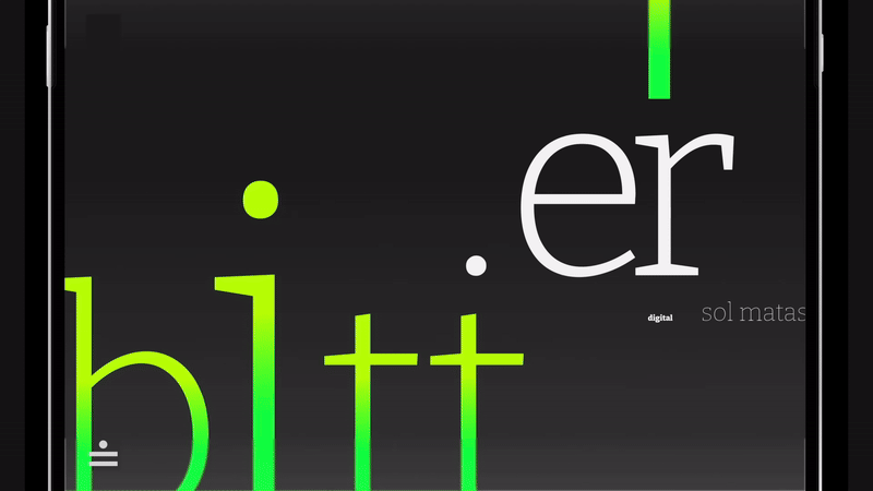
In this problem, I was tasked with developing and presenting the design of an interactive webpage for a digital type specimen. I chose the type family Bitter by Sol Mattas. The goal of my approach was to bring attention to the style and visual details of interest in the type family for the core audience.
Audience:
Professional designers & purchasers of type
Professional designers & purchasers of type
Project Goal:
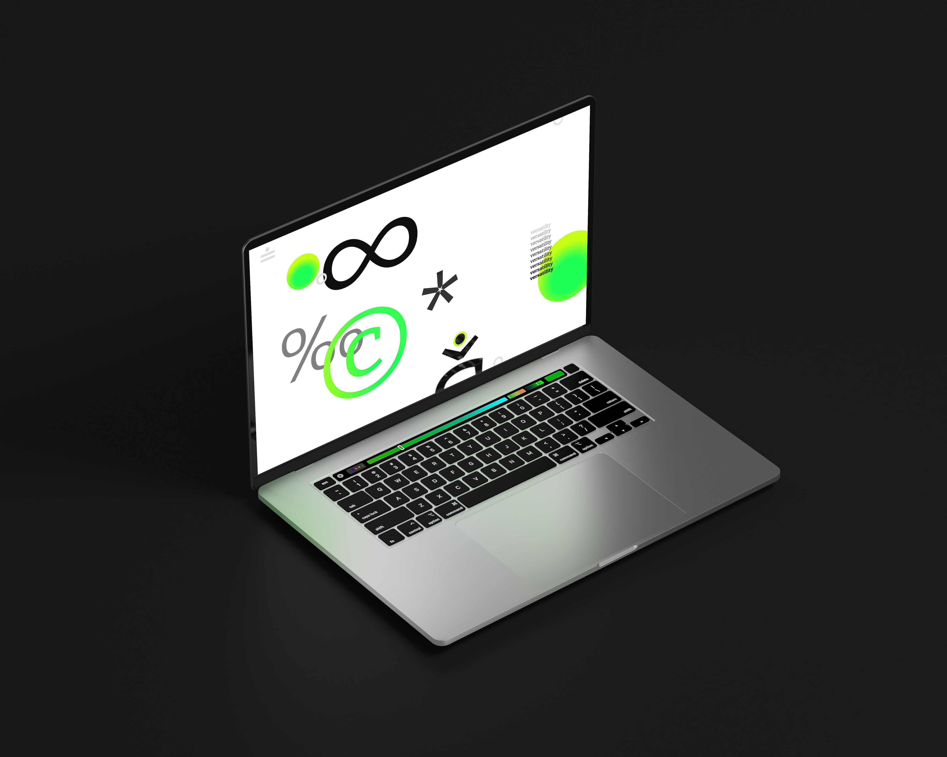
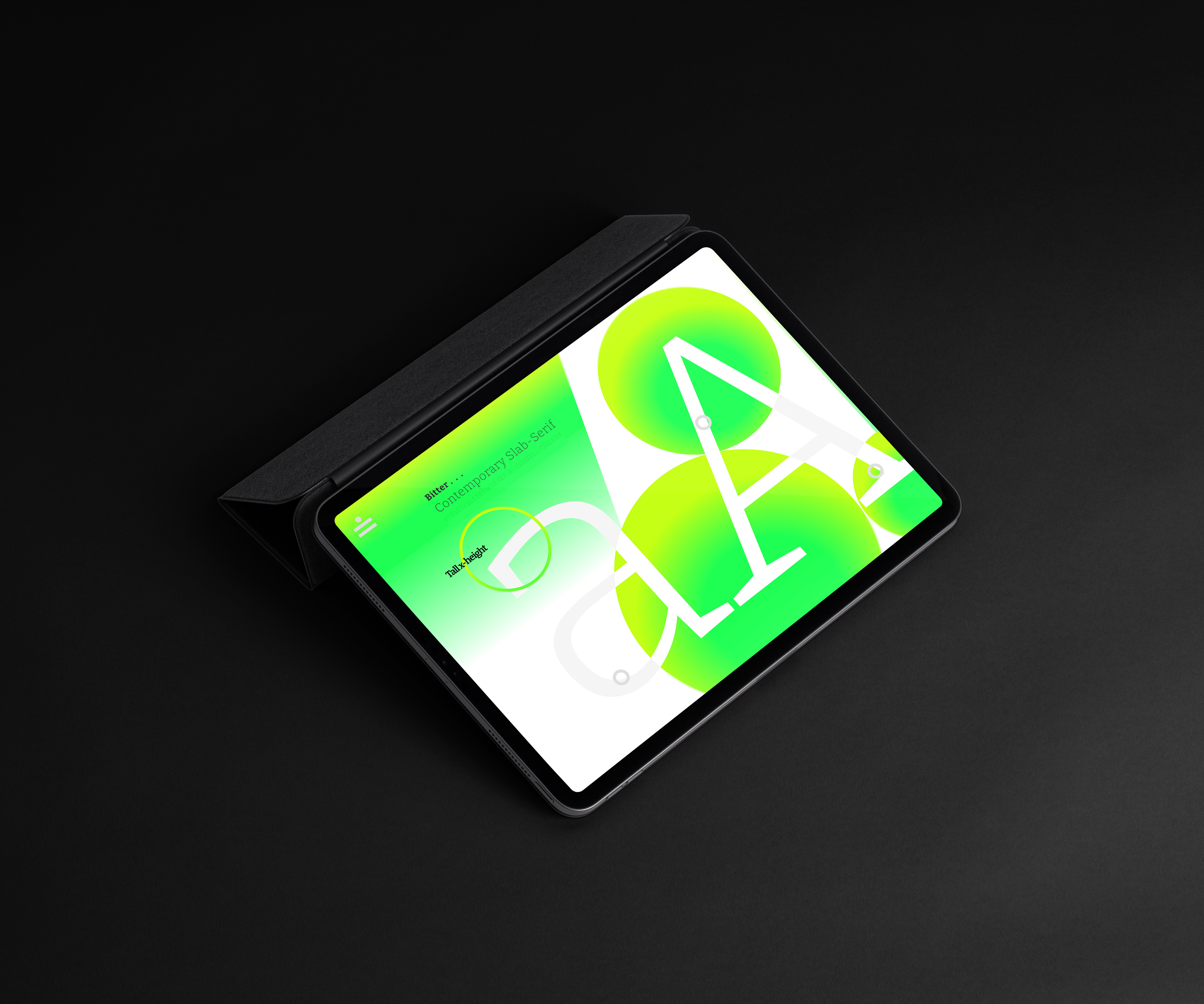
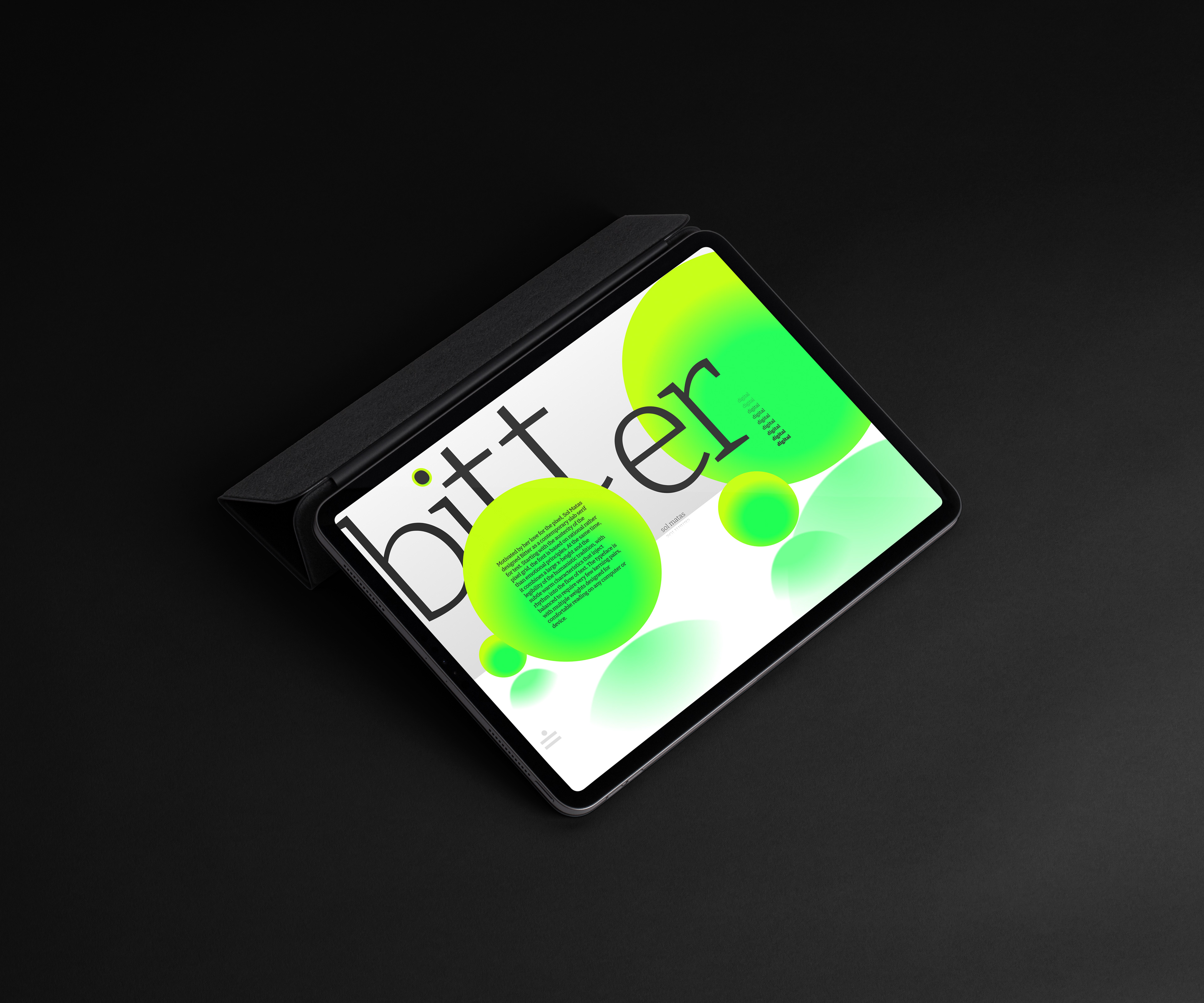
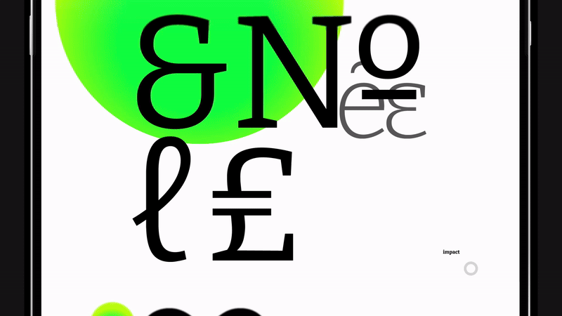
bring attention to the font’s style & interesting visual details
highlight a few special characters or glyphs
showcase all weights & widths
showcase at least one full alphabet & number set
communicate the style classification
bring attention to the font’s style & interesting visual details
highlight a few special characters or glyphs
showcase all weights & widths
showcase at least one full alphabet & number set
communicate the style classification
Approach
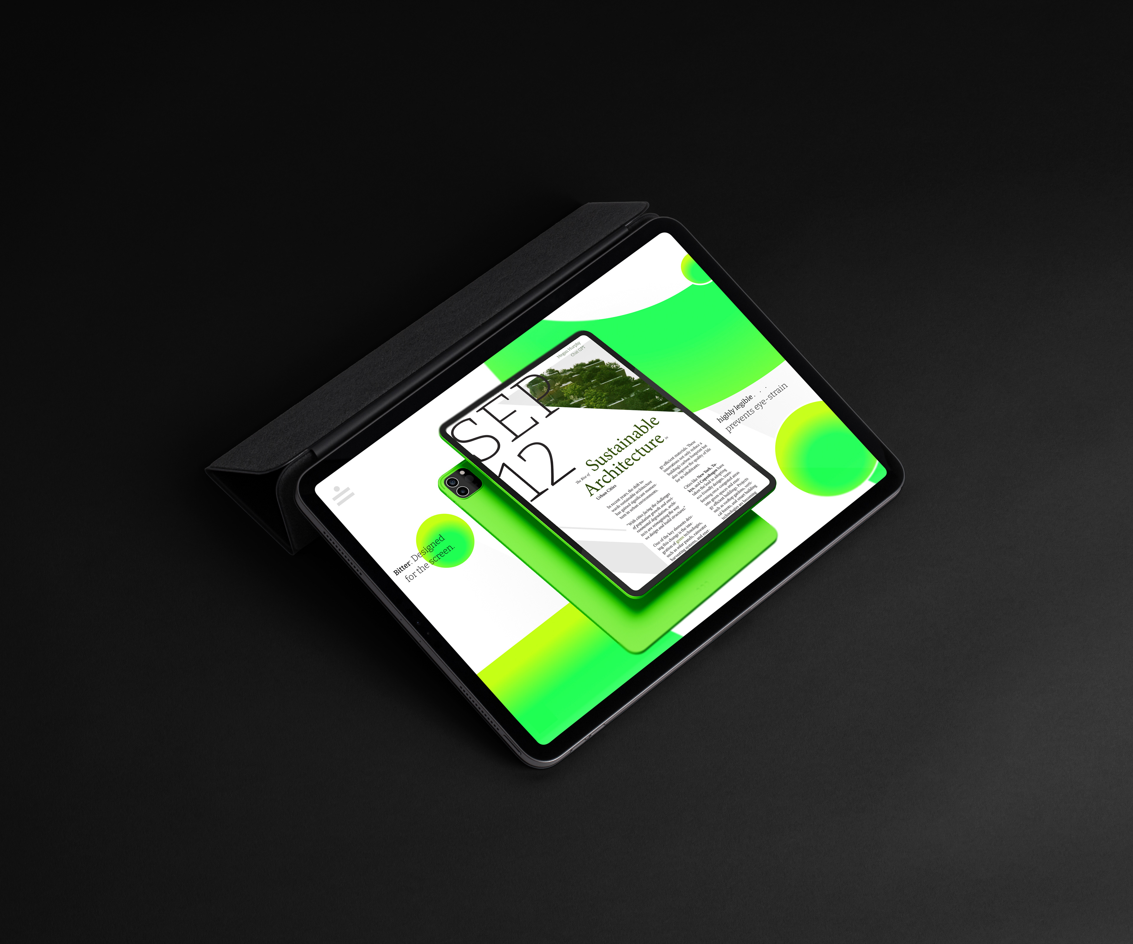
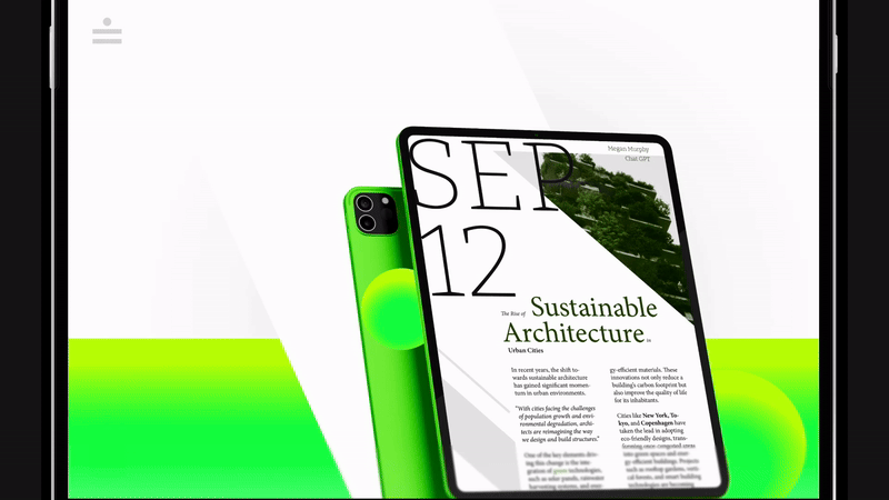
Early in my process, I made and tested multiple potential layouts and color options. I decided to settle on something modern and "digital" to highlight this specific font's digital legibility. During revisions, I locked on to my decided "digital" theme and created a standard color palette and feel to showcase the type's unique character, highlight its versatility, and entice the potential buyer. I was really looking for ways to highlight this font's unique glyphs, and legibility at various scales/weights as the font's purpose is mainly for digital reading. I also looked for opportunities to further spotlight the beauty, versatility, or common use cases for the type, and make micro-interactions that would engage the user's interest while communicating important details, and hopefully encourage further interaction with the type family.
Early in my process, I made and tested multiple potential layouts and color options. I decided to settle on something modern and "digital" to highlight this specific font's digital legibility. During revisions, I locked on to my decided "digital" theme and created a standard color palette and feel to showcase the type's unique character, highlight its versatility, and entice the potential buyer. I was really looking for ways to highlight this font's unique glyphs, and legibility at various scales/weights as the font's purpose is mainly for digital reading. I also looked for opportunities to further spotlight the beauty, versatility, or common use cases for the type, and make micro-interactions that would engage the user's interest while communicating important details, and hopefully encourage further interaction with the type family.