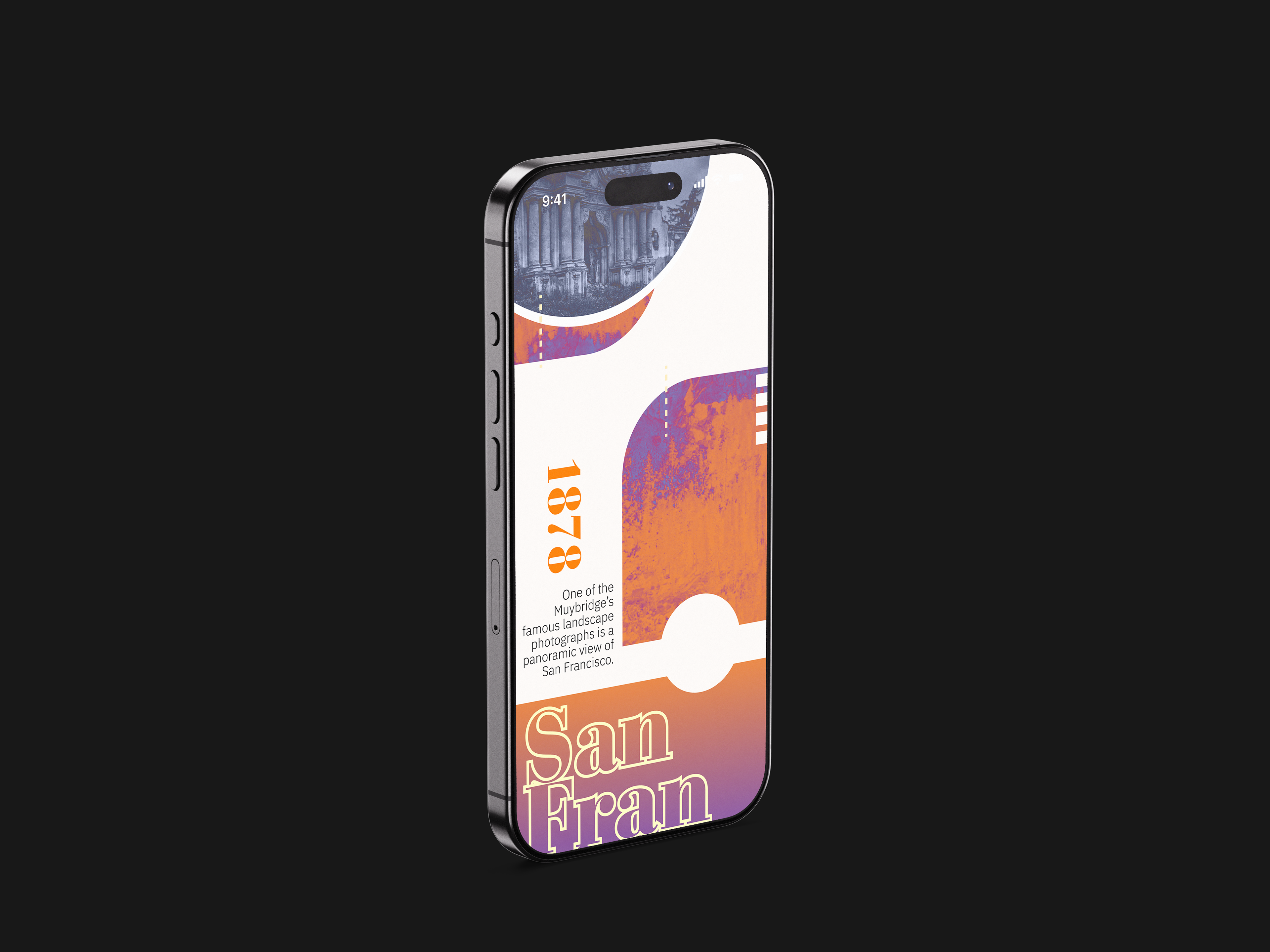
This client is producing an interactive, digital series of brief "quick-dive” articles on the topic of entrepreneurs & inventors who've had a profound impact on the moving image. I was tasked to design and lay out a sample “a life in brief” page on Edweard Muybridge, showcasing his work and story for the viewer in the interactive context of a mobile phone.
Approach
After reading about Muybridge’s his life story and impact on photography, science, and the moving image, and getting to know his imagery, I began to investigate color, typesetting, and layout ideas, designing and testing a couple different directions. The imagery and mobile phone context allowed for tap-based user interaction, so I made an image carousel, tap and zoom option to see photo details, and I added some micro-animations to help the reader understand the nature of Muybridge's inventions & contributions to the moving image.
After reading about Muybridge’s his life story and impact on photography, science, and the moving image, and getting to know his imagery, I began to investigate color, typesetting, and layout ideas, designing and testing a couple different directions. The imagery and mobile phone context allowed for tap-based user interaction, so I made an image carousel, tap and zoom option to see photo details, and I added some micro-animations to help the reader understand the nature of Muybridge's inventions & contributions to the moving image.
Testing and Observation
During testing and observation with peer users of my early prototypes, I realized that the zoopraxiscope interaction needed to be tweaked for better clarity as the original animation was hard to see at a small scale.
During testing and observation with peer users of my early prototypes, I realized that the zoopraxiscope interaction needed to be tweaked for better clarity as the original animation was hard to see at a small scale.
Comparison Survey
When conducting a visual survey that looked at paragraph typesetting and text scales for mobile reading, my design team collected examples across various museum and gallery websites. When directly comparing typesetting and text scales, I noticed my type was a bit smaller than average and decided for better legibility it would be best to adjust my body type to be larger.
When conducting a visual survey that looked at paragraph typesetting and text scales for mobile reading, my design team collected examples across various museum and gallery websites. When directly comparing typesetting and text scales, I noticed my type was a bit smaller than average and decided for better legibility it would be best to adjust my body type to be larger.


